aMoon Venture Capital
Branded investor materials for one of Israel's leading healthtech venture capital firms — designed to carry institutional credibility in every slide.
Branded investor materials for one of Israel's leading healthtech venture capital firms — designed to carry institutional credibility in every slide.
aMoon is one of Israel's most respected healthtech venture capital funds, with a portfolio that spans some of the most significant medical innovation companies in the country. When aMoon walks into a room — whether to present to LPs, introduce portfolio companies, or share their thesis — the materials they bring need to match the caliber of the work they back.
The project centered on developing a suite of branded presentation decks and investor-facing materials: structured, visually disciplined, and designed to communicate complex investment theses and data with clarity and impact. The visual system needed to feel premium, authoritative, and unmistakably on-brand — without ever letting design get in the way of content.
Venture capital decks live and die on clarity. In a high-stakes investor meeting, a cluttered slide or an inconsistent layout isn't just a visual problem — it becomes a credibility problem. The materials needed to be polished without being distracting, and structured in a way that made complex information fast to absorb.
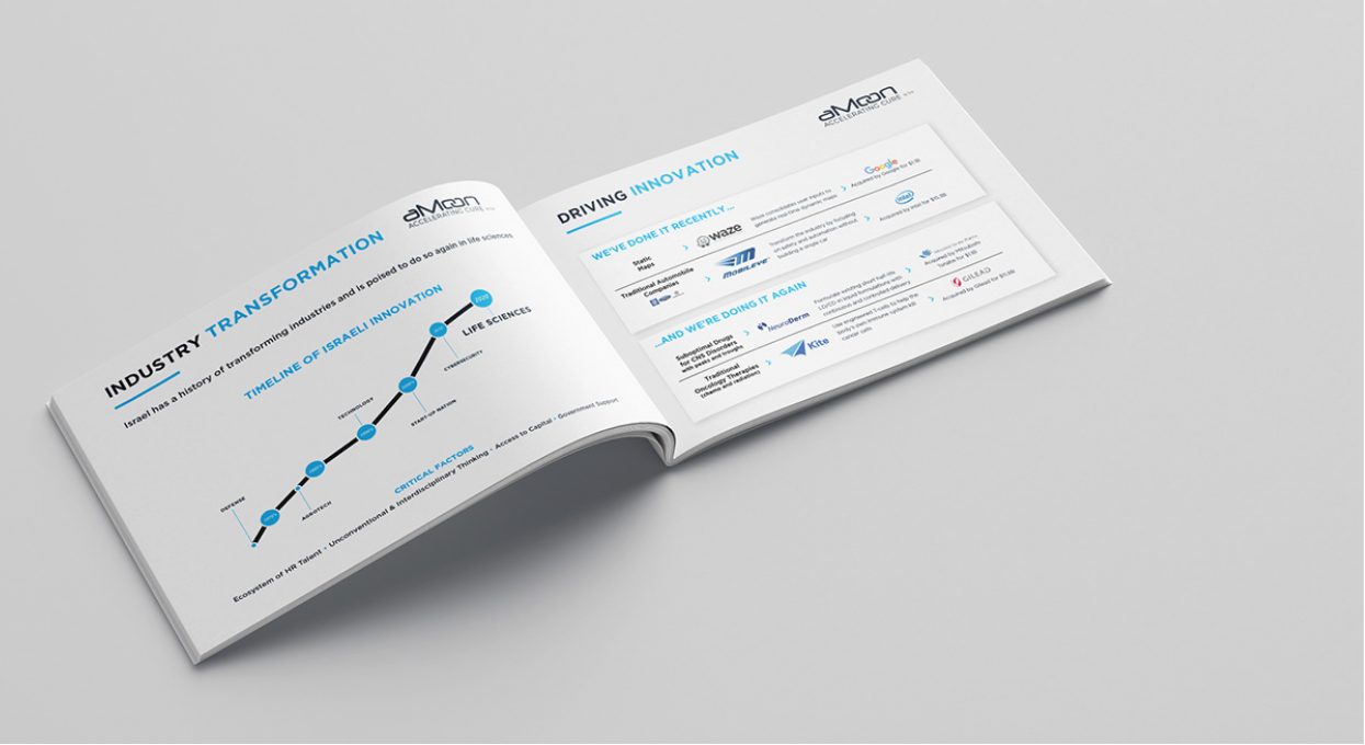
aMoon also operates at the intersection of science, business, and investment. Their materials regularly cover clinical data, market analysis, and portfolio performance — content that demands precise, considered data visualization rather than generic chart templates. Every element needed to serve a specific communicative purpose.
The work started by establishing a visual framework — a grid system, a type hierarchy, and a set of layout templates that could accommodate the full range of content types aMoon needed to present. The goal was to make the brand consistent enough that any deck produced within the system would feel like part of a coherent family, while remaining flexible enough to serve different presentation contexts.
aMoon's identity is built on clean, confident blues — a palette that already projected authority. The design work extended that language into data visualization, building chart and graph styles that felt native to the brand rather than bolted on from a default template.
The final output was a set of master deck templates that the internal team could populate and adapt — reducing the time spent on formatting and giving the team a consistent, professional baseline for every external communication.
aMoon received a complete branded presentation system — templates, data visualization standards, and a visual framework — that gave their team the tools to produce investor-grade materials consistently and efficiently. The decks projected the institutional credibility that aMoon's position in the market demands, while making complex information easy to engage with and fast to absorb.
Investor decks, board presentations, and stakeholder communications all deserve the same level of strategic design. Let's talk.