Vine Unity Center
A brand identity built around the idea that community grows from a shared center — and the people within it are the design.
A brand identity built around the idea that community grows from a shared center — and the people within it are the design.
Vine Unity Center was establishing itself as a non-profit community incubator — a space dedicated to nurturing initiatives, supporting individuals, and building the kind of connective tissue that makes communities genuinely stronger. The organization had a clear vision and a committed team. What it lacked was a visual identity that could carry that vision into the world.
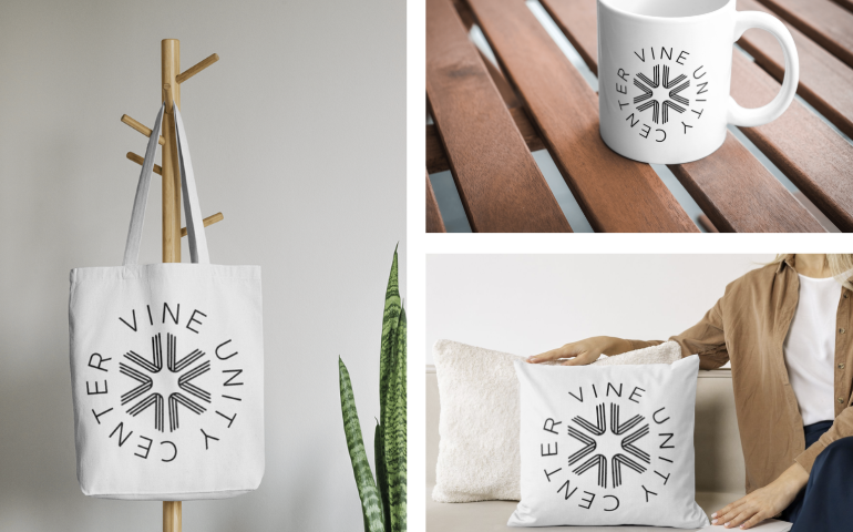
The project required more than a logo. It required a system — one flexible enough to work across print, digital, and physical merchandise, and one that could speak to the range of people and organizations a community incubator serves. From signage to social media to a branded tote bag, the identity needed to hold together everywhere it appeared.
Non-profit branding often falls into one of two traps: either it's so professionally polished that it feels corporate and distant, or it's so casual that it struggles to be taken seriously by institutional funders and partners. Vine Unity Center needed to occupy a more nuanced space.
The brand had to feel genuinely human — warm, inclusive, community-rooted — while also projecting the credibility of a well-run, serious organization. It needed to attract participants, donors, and organizational partners with equal conviction.
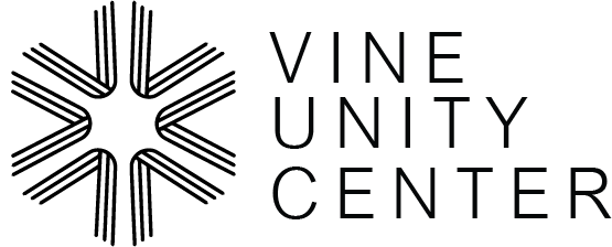
The central design challenge was finding a visual metaphor that could carry the weight of the organization's name and mission without becoming literal or heavy-handed. The resulting mark — a radial, vine-like geometric form — drew from natural growth patterns and the idea of interconnected strands converging at a shared center. It read as modern and bold, while carrying an unmistakably organic quality.
The identity was developed as a complete system from the start: monochrome and color variants, scale rules, and defined use cases for each application. Rather than designing a logo and then seeing where it could fit, the design process anticipated the full range of touchpoints — print collateral, digital assets, and physical merchandise — and built the system to serve all of them cleanly.
The restraint of the black-and-white palette was intentional: it gave the identity a timeless quality, made it versatile across any application, and ensured the community center itself — and its people — remained the focal point.
Vine Unity Center received a complete visual identity system that travels naturally from a tote bag to a website header to a printed program. The mark became a recognizable symbol for the organization's work in the community — strong enough to stand alone, flexible enough to adapt. The system gave the team full creative independence while maintaining consistency across all outputs.
Non-profits, community organizations, and social enterprises deserve branding that's as thoughtful as the work they do. Let's talk.